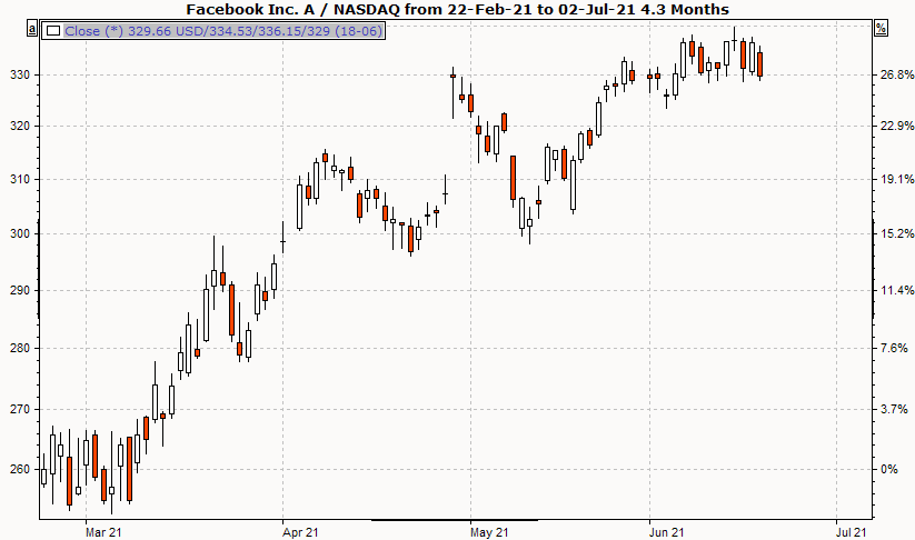
Interpretation of the candlestick chart
Candlestick charts (or candlestick charts) are similar to bar charts. In addition to the high, low and closing price, you can also see whether the closing price (Close) is above or below the opening price (Open) of the day. If it is quoted above the opening price, the rectangle is drawn in white by default; if it is quoted below the opening price, it is drawn in red.
You can change this setting via the parameters of the candlestick chart. The vertical line represents the high and low price.
Candlestick charts allow for a variety of interpretations, which unfortunately cannot all be presented in the scope of this documentation. You can find more information in the literature listed.
Display candlestick chart
-
To display a time series as a candlestick chart, mark the price trend.
-
Then select the DISPLAY, CANDLESTICK command in the context menu of the selected time series.
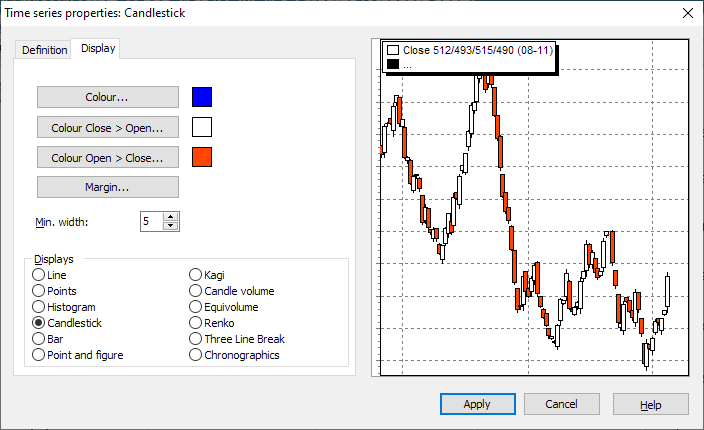
Candlestick chart settings
To change the settings, select the time series and choose the command TIME SERIES... from the context menu.
Here the positions differ slightly depending on which chart form was selected. The general positions (color, scale assignment, etc.) are described in the section Line chart and general settings , the special settings for candlestick charts can be found here.
|
Field |
Description |
|---|---|
|
Color Close > Open |
Select this button to define the color of the candles that have risen during the course of the day in the following dialog box. |
|
Color Open > Close |
Select this button to define the color of the candles that have fallen during the course of the day in the following dialog box. |
|
Edge |
Use this button to set the line width of the candle border. |
|
Minimum width |
In this field you can change the minimum width of the candles. |