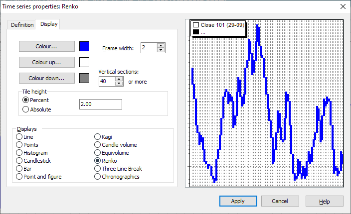
Interpretation of the Renko chart
The Renko chart consists of a series of boxes that are all the same size. The boxes are filled in white when the price is rising and gray when the price is falling.
The rows are extended further as long as the course continues its direction of movement. If the price changes direction, a new row is started in the next column. The current closing price is compared with the highest or lowest price of the previous day.
The Renko chart is displayed independently of the time axis.
As a rule, a buy signal is given when the filling of the boxes changes from gray to white and a sell signal when the filling changes from white to gray.
Display Renko chart
-
To display a chart as a Renko chart, select the time series.
-
Then select the DARSTELLUNG, RENKO command in the context menu.
Renko chart settings
Make settings in the "Time series properties" dialog box. You can change these options by clicking on the corresponding fields or checkboxes.
|
Field |
Description |
|---|---|
|
Color up/down |
Set the fill color for the boxes here. |
|
Vertical sections |
Enter the minimum number of vertical sections to be displayed in the chart window here. |
|
Tile height |
Enter the "Box size" here. The height of the boxes is measured against this. You can specify the amount as a percentage (default) or absolute. |