Interpretation of the Equivolume chart
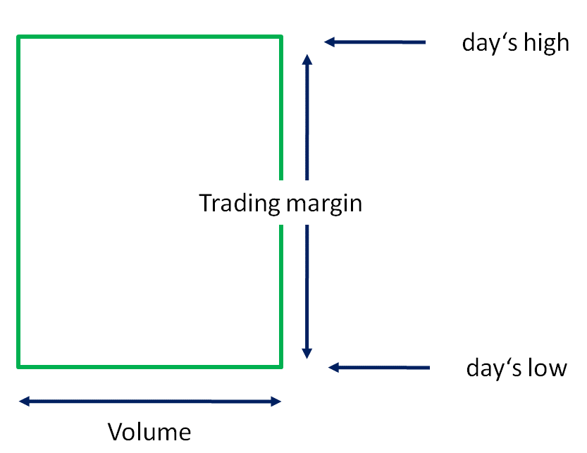
The special feature of the Equivolume charts is that a combination of price and volume (turnover) is shown in a two-dimensional box. In this way, volume is given a higher priority.
The height of a box represents the highest or lowest price of a trading day (trading range). The width of the box is determined by the turnover. The wider the box, the higher the turnover.
This allows daily price fluctuations and unit sales to be compared directly.
Closing price and opening price are not marked, but positive and negative days are differentiated by the color of the boxes. As with the bar charts, a green box is formed when the closing price is above the opening price. If the closing price is below the opening price, a red box is drawn.
Display equivolume chart
To display a chart as an equivolume chart, select the time series and then select the DARSTELLUNG, EQUIVOLUME command in the context menu.
Settings of the Equivolume chart
To change the settings, select the time series and choose the Time series... command from the context menu. In the "Time series properties" dialog box, you can immediately see the consequences of the changes.
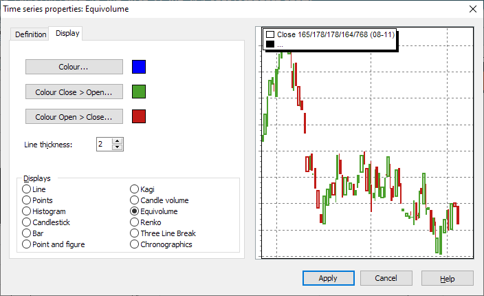
The special settings for Equivolume charts can be found below.
|
Field |
Description |
|---|---|
|
Color |
The color of the time series is defined here. A change in the Equivolume charts makes no sense. |
|
Color Close > Open |
Green: Green boxes symbolize a positive interval (day, week, month). The closing price was higher than the opening price. Select the button if you want to change the color. |
|
Color Open > Close |
Red: Red boxes symbolize a negative interval. The closing price was below the opening price. Select the button if you want to change the color. |