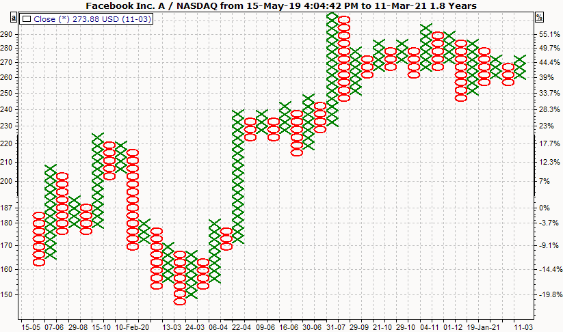
Interpretation of the point-and-figure chart
In contrast to the line and bar charts, the point-and-figure chart shows larger trends and is more suitable for medium to long-term analysis. The point-and-figure chart is actually to be understood as an indicator.
The main difference between point-and-figure and line or bar charts is that line charts continue to be drawn each day a new price is determined. The point-and-figure chart is only continued if there is a sufficiently large price change. It is therefore not intended to provide information on the development of a price movement over time.
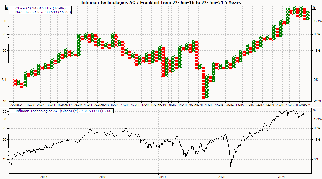
The special feature of the Infront Portfolio Manager is that it can also display a time axis for the point-and-figure charts. You can also show GDs or indicators in the display, even if the price trends are distorted by the variable time axis.
The point-and-figure chart consists of a combination of X and O boxes, also known as boxes. The X stands for rising prices (upward trend), the O for falling prices (downward trend). The presentation is defined by two specifications:
|
Field |
Description |
|---|---|
|
Size of the boxes |
The size of the boxes can be either percentage or absolute. We recommend that you generally specify the box size as a percentage so that this information is independent of the actual price level. |
|
Number of boxes |
The number of boxes that should correspond to a trend reversal is the second specification. The X and O boxes always alternate. Two upward trends can never occur side by side, as they would be combined into one upward trend. Since a new trend (=new vertical row) is only started if a minimum number of boxes can be drawn in the other direction, all smaller price movements, which often lead to misinterpretations, are simply filtered out. The minimum number of boxes that result in a new trend (trend reversal) is referred to as a reversal. A reversal of three boxes (where one box corresponds to a 2% change, for example) means that a new trend is recognized after a change of 6% (= three boxes *2%) compared to the lowest price of the previous trend. |
Display point-and-figure chart
-
To display a time series as a point-and-figure chart, select the price trend.
-
In the context menu, select the DARSTELLUNG, POINT AND FIGURE command.
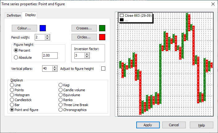
Settings of the point-and-figure chart
To change the settings, select the time series and choose the command TIME SERIES... from the context menu
Here the positions differ slightly depending on which chart form was selected. The general positions (color, scale assignment, etc.) are described in the section Line chart and general settings , the special settings for point-and-figure charts can be found here.
|
Field |
Description |
|---|---|
|
Pin width |
You can define the line width in this field. |
|
Crosses |
Opens a dialog box in which you can define the color of the crosses. |
|
Circles |
Opens a dialog box in which you can define the color of the circles. |
|
Figure height |
Select whether the figures are to be displayed in "Percentage" or "Absolute". The default setting ("Percentage") displays the figures optimally. |
|
Absolute figure height |
Here you can enter an absolute value for the amount of the figures (e.g. 10 means: one figure if the course changes by EUR 10.00). The default setting is "Percentage". If you change the absolute figure height, the value is adjusted accordingly. |
|
Percentage figure height |
Defines the height of the figures as a percentage of the display period. The default setting displays the figures optimally. If you change the percentage figure height, the absolute value is adjusted accordingly. |
|
Reversal factor |
The minimum number of boxes that result in a new trend (trend reversal) is referred to as a reversal. A reversal factor of 3 boxes (where one box corresponds to a 2% change, for example) means that a new trend is recognized after a change of 6% (= three boxes *2%) compared to the lowest price of the previous trend. |
|
Vertical columns |
Specifies the maximum number of vertical figures. |
|
Adapt to figure height |
If you activate this checkbox, you can force the squaring of the figures. The specification of the vertical columns is then no longer effective. |
You can save the setting you have made. This allows you to open "your" point-and-figure chart again and again.
Line chart and point-and-figure chart
-
To display the line chart in a separate chart in addition to the point-and-figure chart, insert the time series of the security a second time in the chart window.
-
Then select a price history and drag it downwards while holding down the left mouse button.
The price trend is shown in a separate chart below the first price trend.