Interpretation of the Kagi chart
The Kagi chart consists of vertical lines that are alternately drawn a little thinner and a little thicker. The lines are extended further as long as the course continues its direction of movement. If the price changes direction, a new line is started in the next column.
The Kagi chart is displayed independently of the time axis.
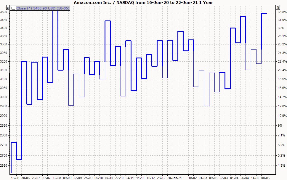
A thick line is drawn when the current closing price is equal to or higher than the opening price on the previous day.
A thin line is drawn if the current closing price is equal to or lower than the opening price of the previous day.
The lines are drawn accordingly if the current closing price - compared to the high or low of the previous day - has moved in the same direction.
As a rule, one assumes a buy signal when the line changes from thin to thick, and a sell signal when the line changes from thick to thin.
Display Kagi chart
-
To display a time series as a Kagi chart, mark the price trend.
-
Then select the DARSTELLUNG, KAGI command in the context menu.
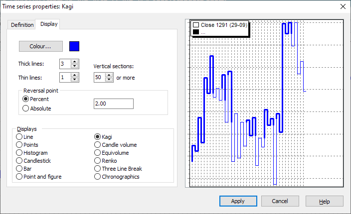
Settings of the Kagi chart
Make settings in the "Time series properties" dialog box. You can change these options by clicking on the corresponding fields or checkboxes.
|
Field |
Description |
|---|---|
|
Thick lines Thin lines |
Set the width of the lines here. |
|
Vertical sections |
Enter the minimum number of vertical sections to be displayed in the chart window here. |
|
Inverse variable |
Enter the "Reversal Amount" here. This is the minimum amount by which the price must move in the opposite direction for a new Kagi line to be drawn in the next column. You can specify the inverse value as a percentage (default) or as an absolute value. |