Interpretation of the candlevolume chart
Candlevolume charts are a combination of candlestick charts(1) and equivolume charts(2 ). This involves adding volume to the candle body determined by the opening price and the closing price.
|
Component |
Description |
|---|---|
|
(1) Candlestick charts |
You can find the statement of the candlesticks in the chapter Candlestick chart. |
|
(2) Equivolume charts |
The special feature of the equivolume charts is that the chart shows a combination of price/rate and volume in the form of a two-dimensional box. This approach gives volume a higher priority. The statement of the Equivolume charts can be found in the chapter Equivolume chart. |
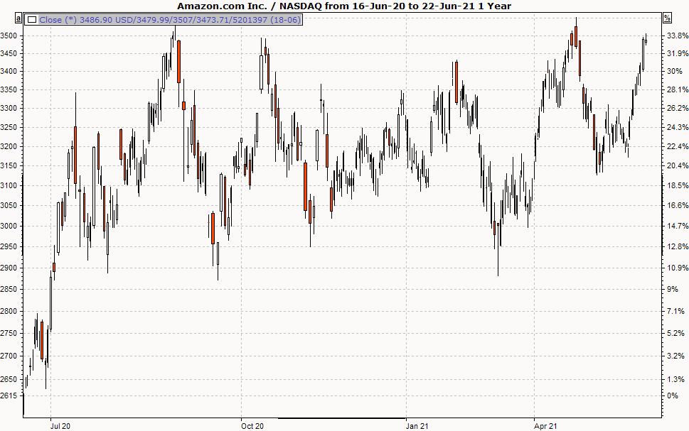
In addition, positive and negative days (or intervals) are color-coded in the candlevolume charts. As with the candlestick chart, the rectangle (the candle) is filled in (red) if the closing price is below the opening price.
If the closing price is above the opening price, only the border is drawn (or filled in white). This provides a good assessment for the viewer.
The vertical line marks the high and low price.
Candlevolume and candlestick charts can be interpreted in many different ways. You can find more information on this topic on the Internet or in the specialist literature listed in the appendix.
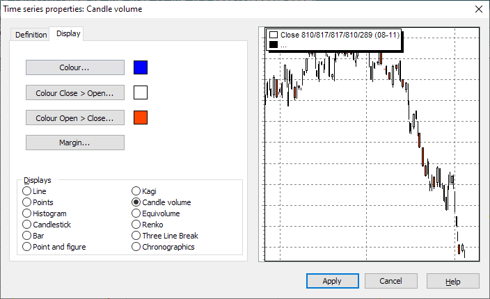
Display candlevolume chart
To display a chart as a candle volume chart, select the time series and then select the DARSTELLUNG, CANDLEVOLUME command in the context menu.
Settings of the candlevolume chart
To change the settings, select the time series and choose the command TIME SERIES... from the context menu
On the "Display" tab, the positions differ slightly depending on which chart form has been selected. The general positions (color, scale assignment, etc.) are described in the section Line chart and general settings . The special settings for candle volume charts largely correspond to those for candlesticks. Here, only the minimum width setting option is omitted, as the width of the candles depends on the turnover.