The portfolio risk figures open as the table described above. Select the "Risk/return chart" tab at the bottom of the window in the work area to switch to the chart display.
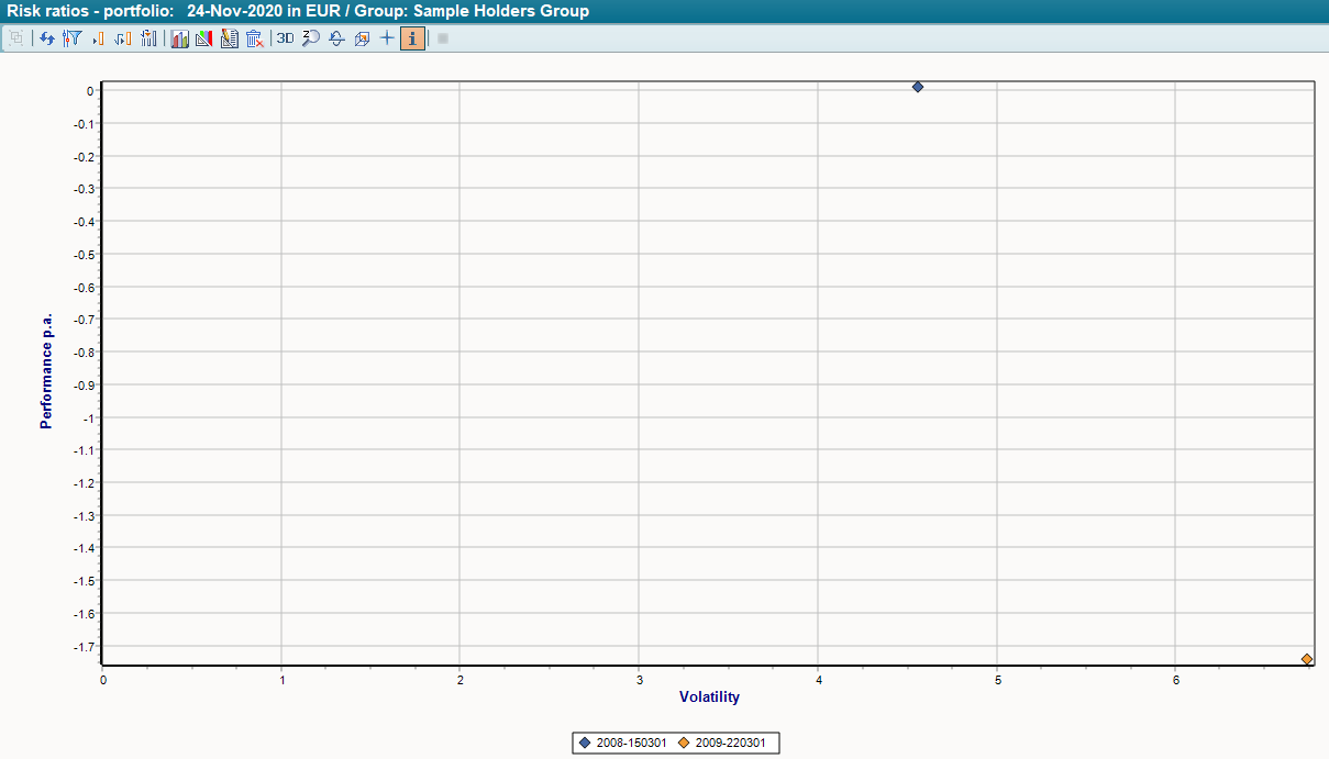
The dots in the diagram mark the owners or portfolios (in the "diamond" style as delivered, see image above). On the Y-axis you can read the return p. a. (=performance p. a.) of the portfolio, on the x-axis the total risk (=volatility).
The risk/return ratio can thus be compared between different holders and in relation to their benchmark. A portfolio can be described as 'better' in comparison to another (or a benchmark) if it either has a higher performance with the same risk or a lower risk with the same performance, or a combination of both. Expressed graphically: The further to the left a point is in the diagram, the better.