The area in which the price trend is shown is called the chart diagram. There can be several charts in a chart window, e.g. it is better to display turnover and some indicators and trading systems in separate charts.
Change the size of the diagrams
You can change the size of the charts so that the chart window remains clear even with several charts.
Proceed as follows to customize chart diagrams via the context menu:
-
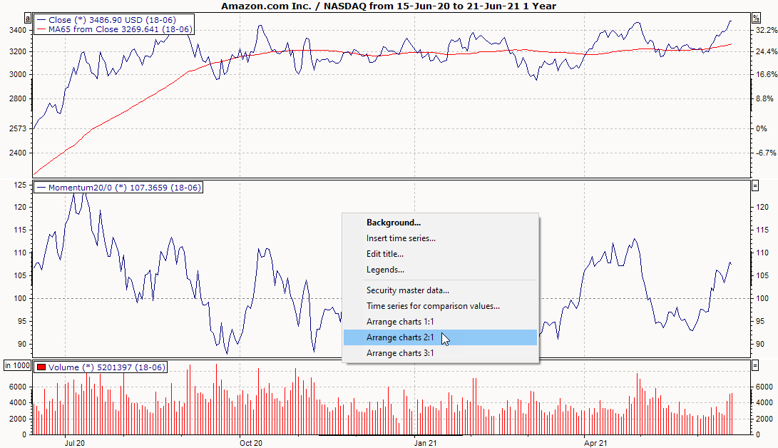
Right-click in the chart background.
-
Select the ORDER CHARTS 1:1, ORDER CHARTS 2:1 or ORDER CHARTS 3:1 command from the context menu.
To customize the size of the chart diagrams, proceed as follows:
-
Move the mouse to the dividing line between two chart diagrams, preferably below the base time series.
-
As soon as the mouse pointer turns into a double arrow, press the left mouse button and move the dividing line.
The lower diagrams are automatically resized. If you save your changes to the chart template, the changed size of the charts will also be applied.
Display diagrams in full screen
To display only one of several charts in the chart window, double-click on the background of the chart. Double-click again to exit this mode.
To close one of the chart diagrams within the chart window, you must remove its content or move it to another diagram.
Drag & drop the time series
You can move selected time series to existing or new diagrams using drag & drop. To do this, drag the time series with the mouse to the new position. The symbols on the mouse pointer will help you:
|
Command |
Pointer |
Description |
|---|---|---|
|
New diagram |
|
To view the selected time series in a new, separate chart, you must drag the time series with the mouse to the edge of a chart or between two existing charts and release the mouse button when the chart symbol on the mouse pointer has a white rectangle as a background. |
|
Drag into existing diagram |
|
If you drag the selected time series into an existing chart, you can add it here; the chart symbol on the mouse pointer will then have a transparent background. |
|
Within the legends draw |
|
If you move the time series within legends, the symbol changes to these lines. This allows you to change the order of the time series in a legend or drag time series into other legends (and therefore also into other chart diagrams). |


-
If you drag a time series into a new chart diagram to be created, the settings of the source chart diagram (such as logarithmic scaling, grid insertion) are adopted for the newly created chart diagram.
-
Double-click on the chart background to maximize or undo the maximization of the clicked chart.
-
If you drag a time series to the right axis and assign it to this time series, a second grid (new horizontal grid lines) related to the right axis is not automatically displayed as before.
-
Chart diagrams can be swapped vertically by simple drag & drop. To do this, simply click with the mouse on the background of the chart diagram to be moved and, holding down the left mouse button, drag the chart diagram up or down. If you release the mouse button at the target, the chart diagrams are immediately rearranged in the chart window.