![]()
Carry out the following steps for each new data series:
-
Select the "New series" button.
The "Series definition" dialog box opens. -
Select a display type from the gallery. The available types are divided into the categories "Standard", "Statistics" and "Other".
-
If you have selected a display mode, a small triangle appears in the bottom left-hand corner. Click on it. A menu opens in which you can choose between various ready-made layouts.
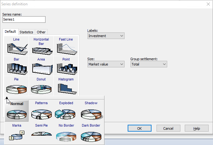
To close this submenu again, click on the small triangle in the top left-hand corner or double-click on the desired layout.
The individual rows of a chart obtain the corresponding data from one or more columns of the table on which the chart is based. You specify which data is used to display a series in the fields on the right-hand side of the "Series definition" window.
Which fields are located here depends on which display type you have selected. Information on the most important fields can be found in the following table:
Field
Description
Labels
From the list, select the column that is to be displayed as a label, e.g. "Name".
All table columns are available here.
X-values
Select from the list which values are to be plotted on the X-axis, e.g. a time value.
If you do not make any entries here, e.g. for a bar chart, the individual bars are plotted on the x-axis at a preset distance.
Only columns containing numbers or data are available.
Y-values
Select from the list which values are to be plotted on the Y-axis.
Only columns containing numbers or data are available.
Z-values
[For 3-D representations, e.g. waterfall, color grid]
Select from the list which values are to be plotted on the Z-axis.
Only columns containing numbers or data are available.
Group billing
If necessary, set the group allocation mode for the column here (corresponds to the totals options in tables). The available modes are:
-
Sum (addition of all group elements)
-
Number (size of the groups)
-
Minimum
-
Maximum (extremes of the group)
-
Average (linear mean value of the group)
-
Weighted average
-
Weighted total (additional indication of weight)
Size
[For pie charts and ring diagrams]
Select from the list which value should be used to calculate the size of the "pie slices".
Only columns containing numbers or data are available.
Radii
[For bubble charts]
Select from the list which value should be used to calculate the size of the bubbles.
Only columns containing numbers or data are available.
-
-
Enter a meaningful name in the "Series name" field. You can also display this name later in the diagram legend.
-
Confirm your settings with "OK". You return to the "Diagram definition" window.