To define the layout of a selected series, select the "Format series" button in the "Diagram definition" dialog box.
![]()
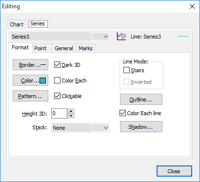
Switch to the "Row" tab and select the row you want to edit from the list. The current display type is shown in a small preview next to the selection list. There are four further tabs on the "Series" tab where you can make the desired settings.
This dialog box is dynamic, i.e. it changes depending on the selected display type.
The fields in this window are self-explanatory, but you will find brief explanations of some interesting options in the table below.
You can make all settings on the tab separately for each row. To do this, first select the desired row from the list at the top of the tab.
|
Field |
Description |
|---|---|
|
Show legend / hide
|
[Row" tab, "General" tab] Activate or deactivate the checkbox
|
|
Change the position of the legend |
[Chart" tab, "Legend" tab] For example, select the alignment of the legend on the "Alignment" tab. Left", "Right", "Top" and "Bottom" are available. You also have the option of specifying an exact user-defined position. |
|
Change the color of the rows in pie charts |
[Row" tab, "Format" tab] Click on the "Color" button on the "Colors" tab to open a dialog box in which you can select a color that will then be used uniformly for the entire row. If the "Each colored" checkbox is activated, each piece is colored differently in pie charts. |
|
Set column/beam width |
[Row" tab, "Format" tab] For column and bar charts, you can specify the width of the column in relation to the maximum width in the "% column width" field on the "Size" tab. |
|
Arrange several rows of columns or bars in the same diagram
|
[Row" tab, "Stack" tab] You can use the selection options in the "Multiple columns" field on the "Stack" tab for column and bar charts to define the arrangement of several columns/bars in relation to each other. For example, "Stacked" or "Side by side" are available. |
|
Open" pie charts |
[Row" tab, "Format" tab] To open the circle in pie charts or ring charts, change the number of degrees in the "Total angle" field. For example, you can create semi-circular diagrams. |
|
Detach individual sector from pie chart |
[Row" tab, "Format" tab] To remove the largest "pie slice" from the pie chart, change the value in the "Largest extra" field. |
All changes are immediately applied to the diagram. Make the desired settings and close the dialog box again.